
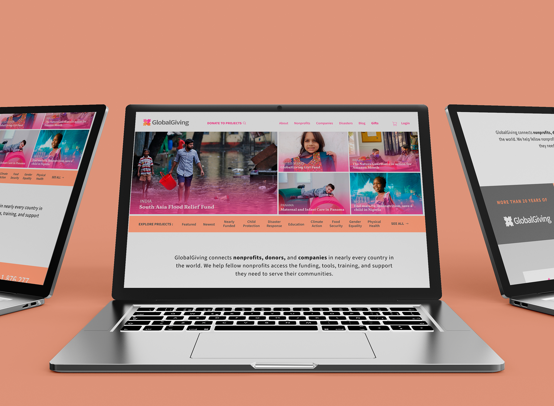
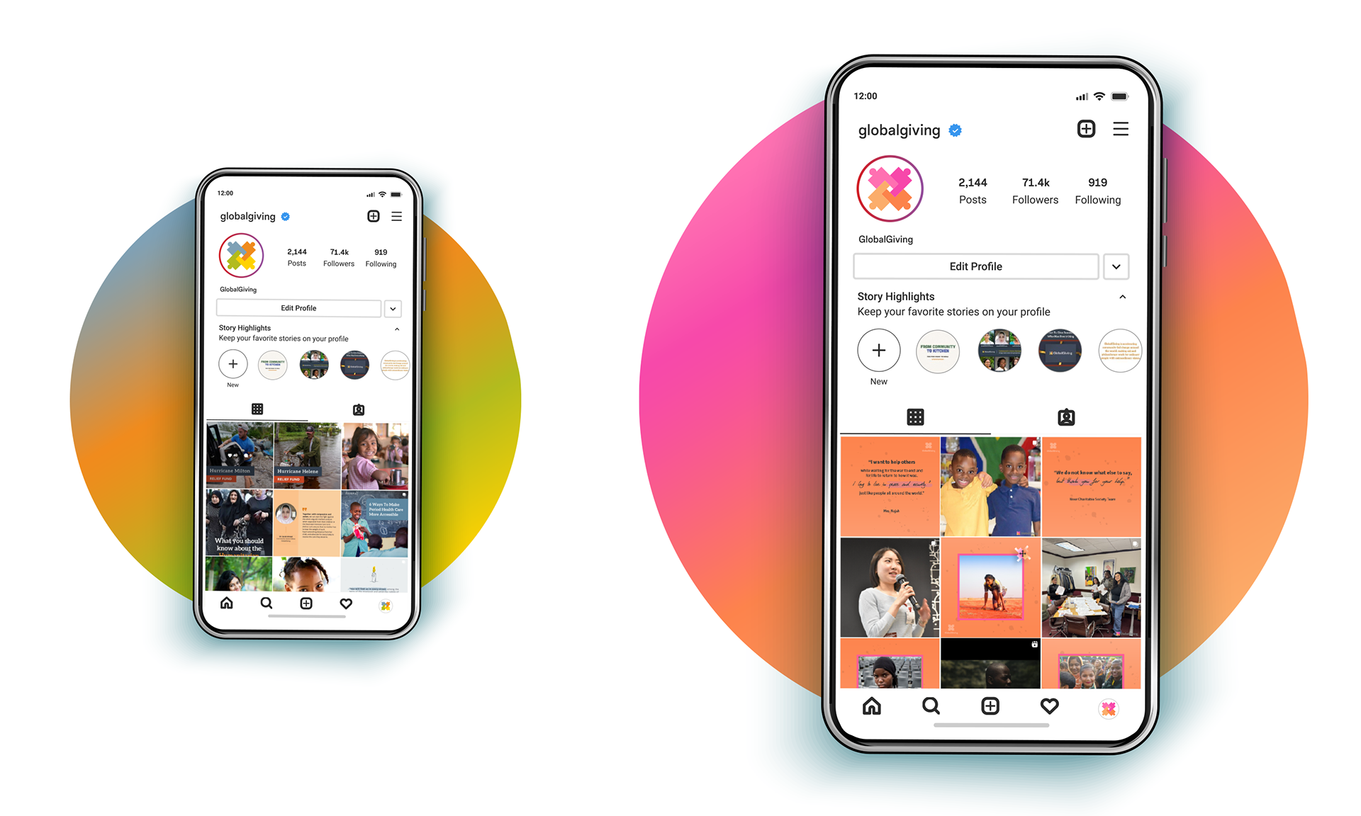
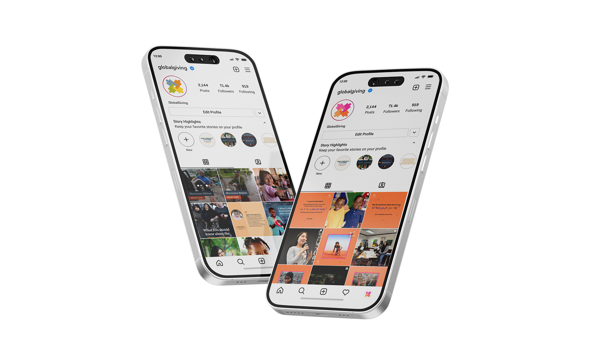
The GlobalGiving Brand Audit refined the organization’s visual identity with a more cohesive design. Updates to the color palette, typography, and imagery aligned with the mission of community-led change, introducing vibrant colors that encouraged donor engagement while maintaining the gravity of disaster relief efforts.
My Role(s)
My role in this project was to shift the tone of GlobalGiving’s brand to portray a more uplifting, approachable message while still respecting the seriousness of disaster relief. I focused on introducing brighter, more vibrant colors to create an inviting atmosphere, encouraging positive engagement while conveying the urgency and gravity of the situations faced by communities in dire need of supplies and help.
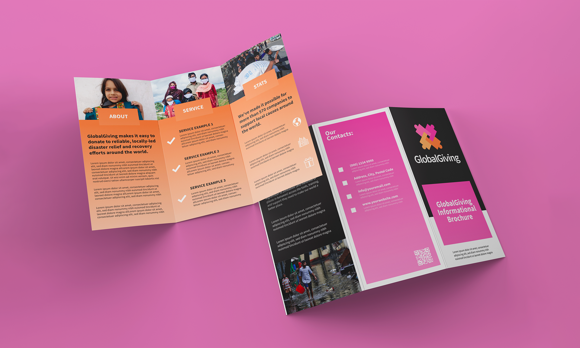
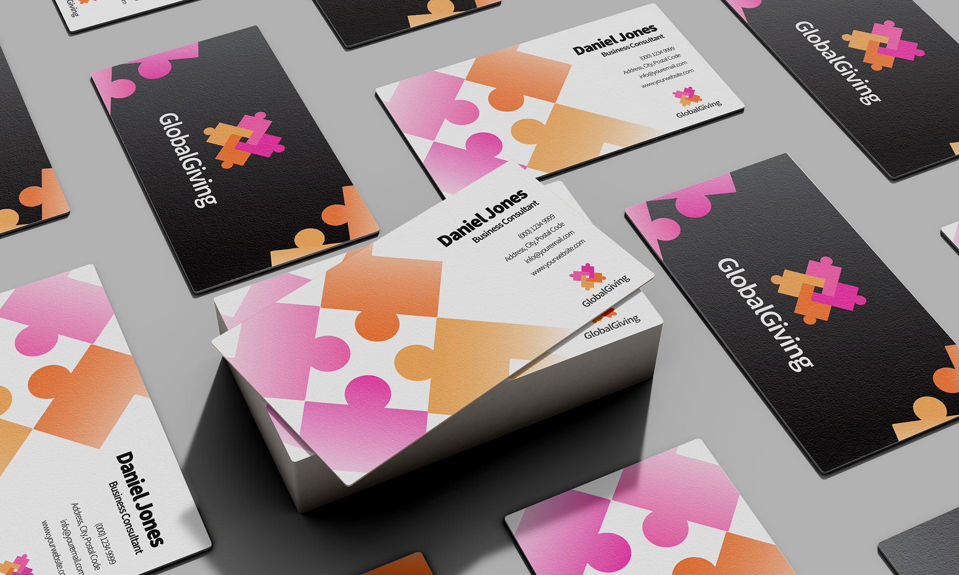
Brochure and Business Card


3D Packaging Exploration